

CAYA (Come As You Are)
About
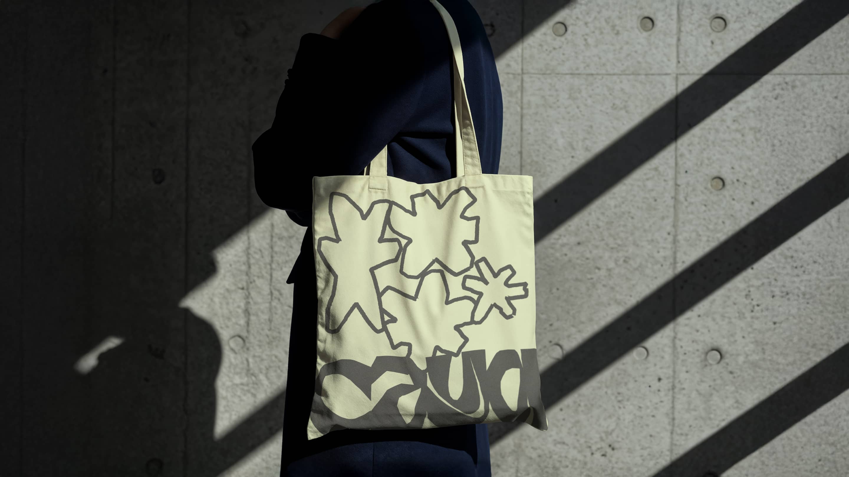
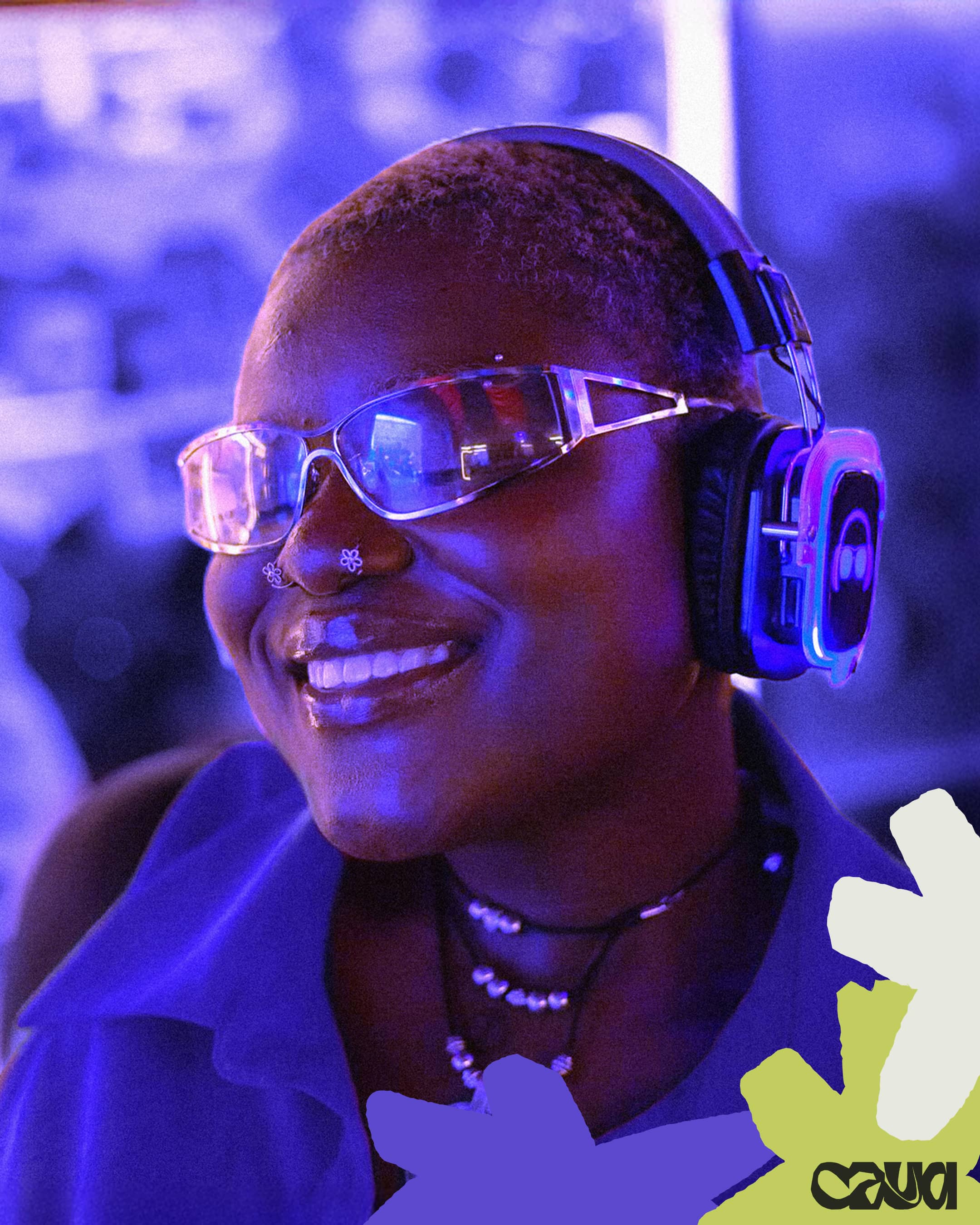
Come as you are - Creating space for Black & Brown queer folks to connect
Scope
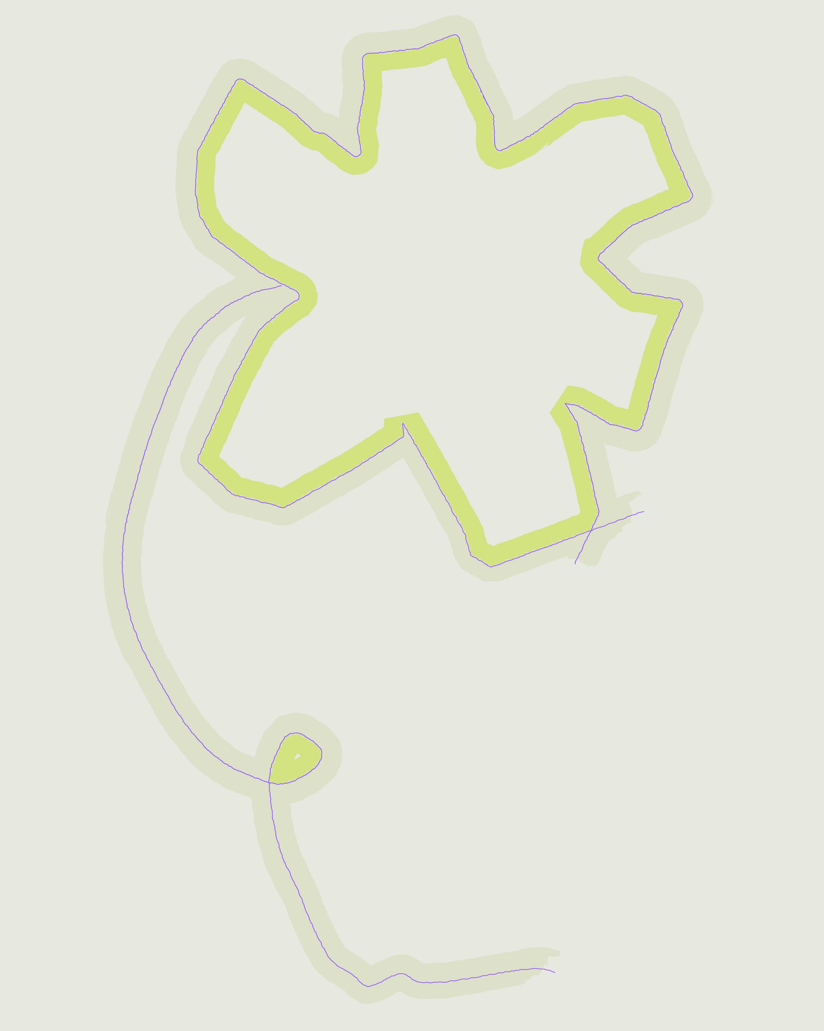
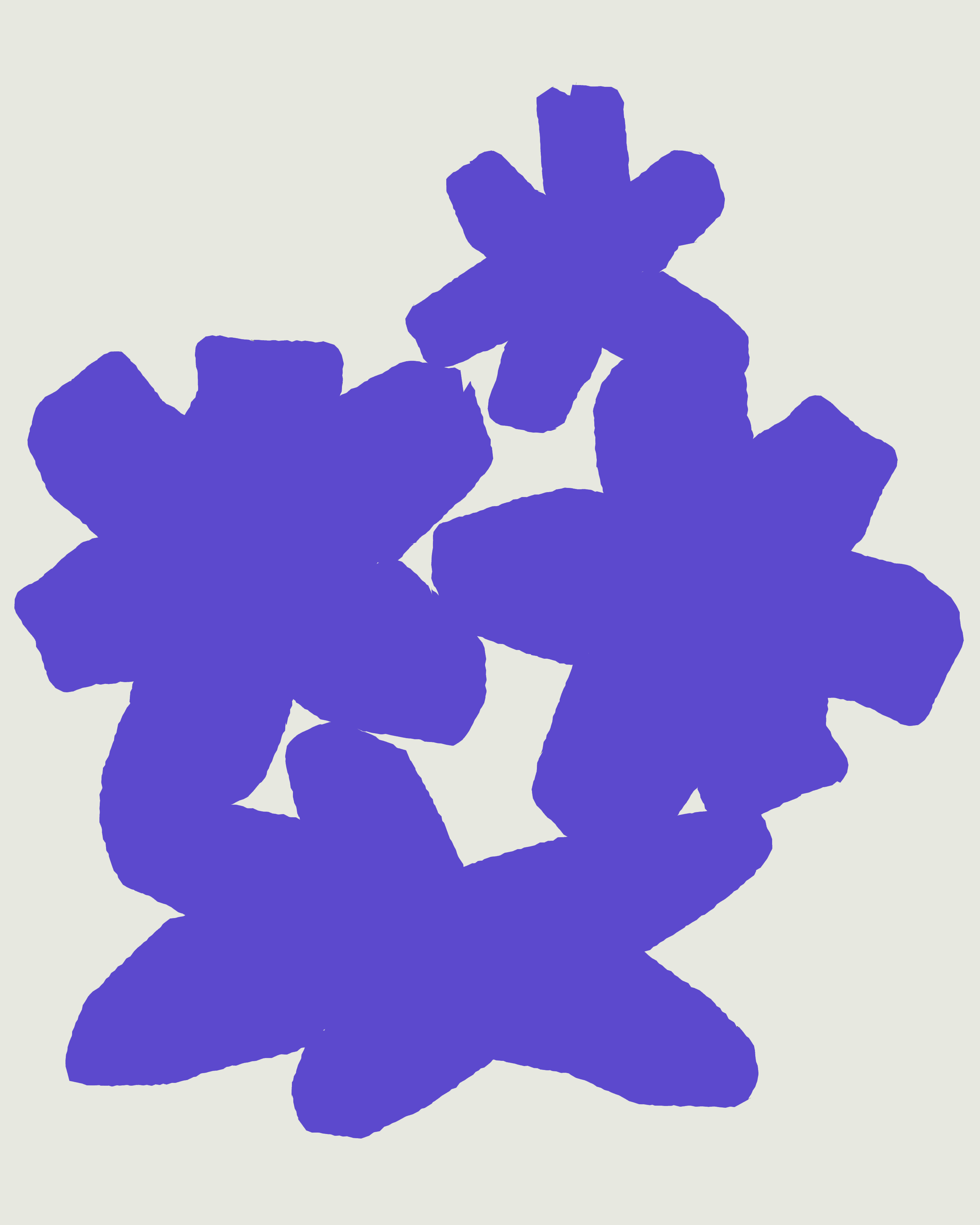
Brand Identity, Graphic design
Project
CAYA (Come As You Are)
About
Come as you are - Creating space for Black & Brown queer folks to connect
Scope
Brand Identity, Graphic design